Pictograms
From pictures worth 1 or 2 to keys of 4, 20 or 100 with quarter and half pictures, to read and to complete.
Reading and drawing charts is the heart of data handling at school and one of the skills PISA assesses: understanding what a chart says, comparing data and drawing conclusions. This free statistical charts worksheet generator creates A4 worksheets with pictograms, bar charts, line graphs, pie charts and frequency tables, with new data every time and an answer key with the finished chart and every answer.
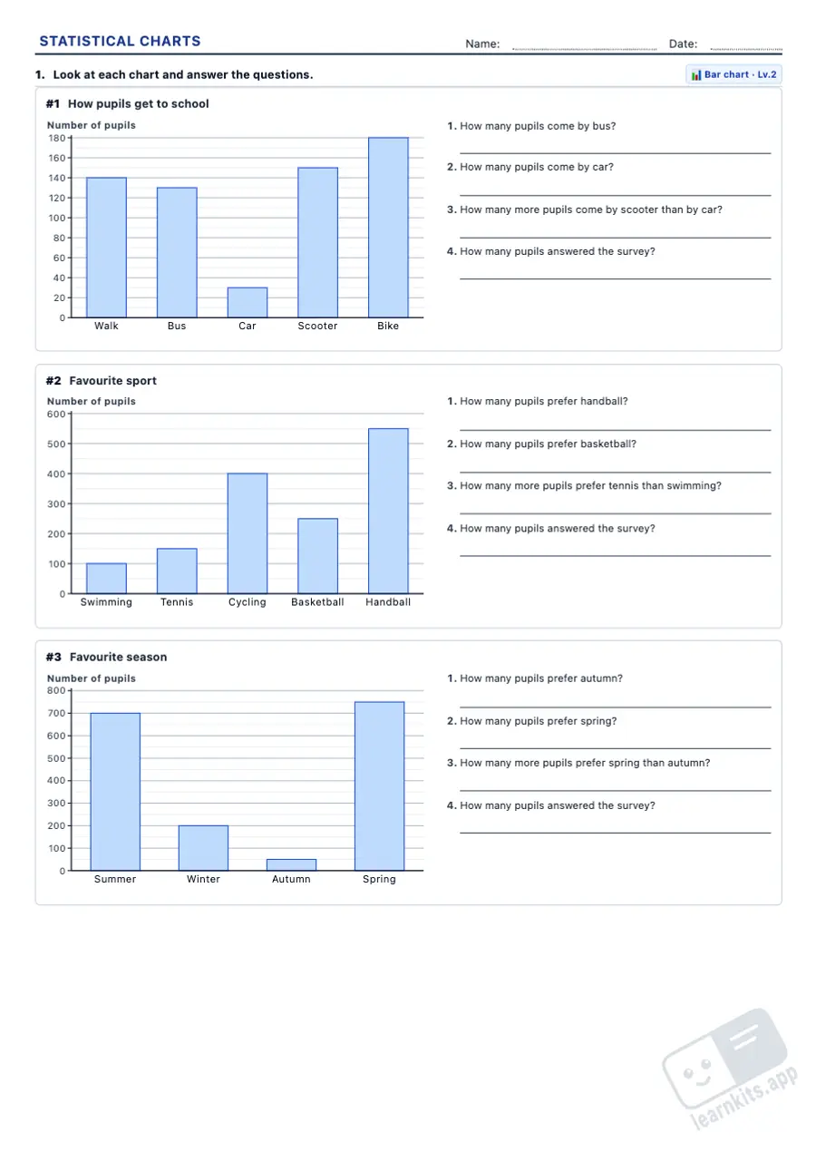 Student worksheet
 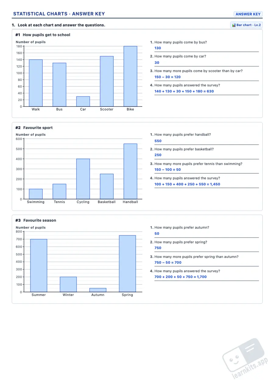 Answer key
 From pictures worth 1 or 2 to keys of 4, 20 or 100 with quarter and half pictures, to read and to complete.
Scales in 1s up to scales with thin lines, and double bar charts to compare two groups and find the mode.
Temperatures, a growing plant, sales and visits: values, rises, the mean and the range, also with two lines and temperatures below zero.
Equal parts and fractions, percentages on a circle marked every 5 % and angles with a printed protractor ring, so no tools are needed.
Tally charts, frequency and relative frequency, percentages, mode, mean and median.
The finished chart, the completed table and every answer with its working, always from the values printed on the sheet.
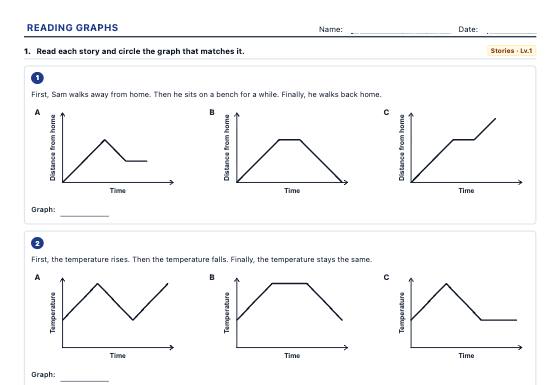
Everyday graphs to match to a story, read values and rates of change, describe trends, compare two series and spot misleading graphs, with an answer key.
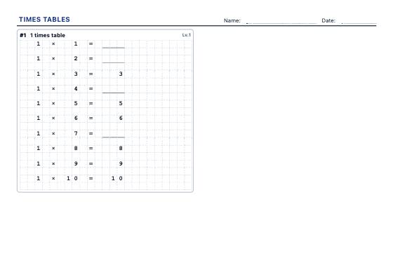
A4 worksheets for the tables you choose: complete the table, shuffled facts, missing factors, multiplication grids and division facts, in three levels with an answer key.
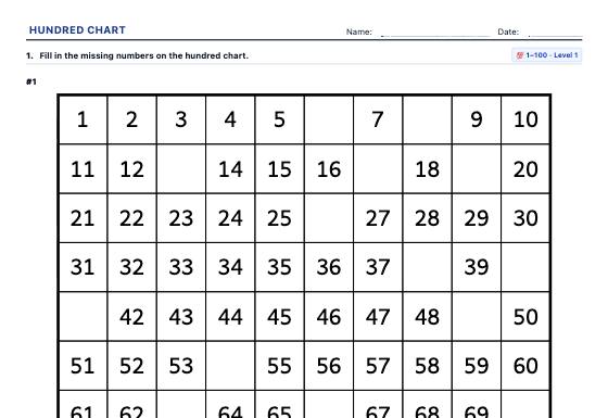
A4 hundred chart worksheets: missing numbers, chart pieces, neighbours (+1, −1, +10, −10), skip counting and colouring patterns, in three levels with an answer key.