Real station data
Climate normals from over 45 stations (Met Office, NOAA, AEMET and other weather services): from Dublin to Riyadh and from Bangkok to Yakutsk.
A climate graph sums up the climate of a place in one chart: monthly precipitation as bars and mean temperature as a line. This free climate graph worksheet generator creates A4 worksheets with real weather station data to draw climate graphs, analyse them and identify the climates of the world and of Spain, always with an answer key.
Climate normals from over 45 stations (Met Office, NOAA, AEMET and other weather services): from Dublin to Riyadh and from Bangkok to Yakutsk.
A data table and a ready grid on the P = 2T scale. At level 3, students number the axes themselves.
From reading the graph to working out the temperature range, mean temperature and total precipitation, and explaining the climate type.
Four climate graphs per sheet and the list of climates: equatorial, tropical, hot desert, Mediterranean, oceanic, continental, polar and mountain.
Oceanic, coastal, inland and semi-arid Mediterranean, subtropical Canary Islands and mountain, with stations from each area.
The finished graph, the answers worked out from the printed data and the features of each climate.
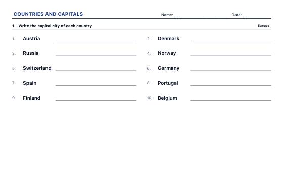
Worksheets to write the capital or the country, match them with arrows and choose the right answer, continent by continent and at three levels, from the best-known countries to every UN member.
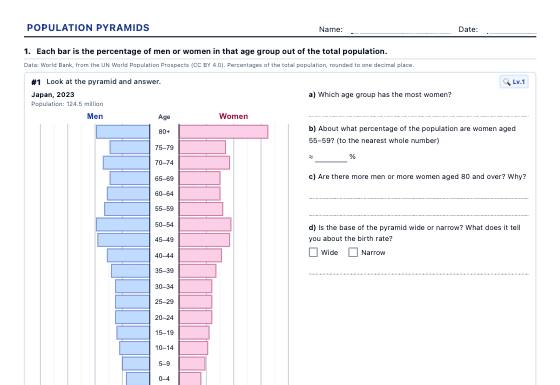
Population pyramids with real data from 40 countries (1960-2023) to read and classify, draw from a table, work out demographic indicators and compare, with an answer key.
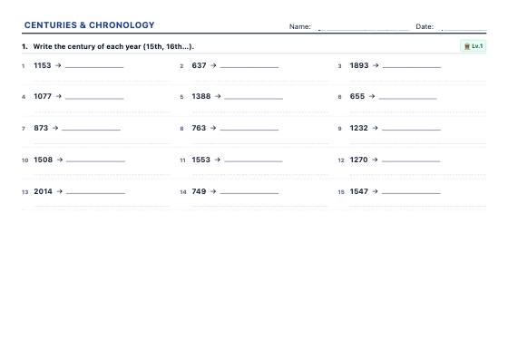
Unlimited exercises to turn years into centuries, place dates BC and AD, work out elapsed years and put events in order, with an answer key.