Stories and graphs
Match a story to its distance-time, temperature-time or battery graph: rises, falls, stops, quickly or slowly.
Interpreting graphs is one of the skills that national tests and PISA assess the most: reading one point is not enough, students have to understand the story the line tells. This free reading graphs worksheet generator makes A4 worksheets with everyday graphs (walks, water tanks, a phone battery, temperature, savings) drawn from generated data, from Grade 5 to Grade 10, always with an answer key.
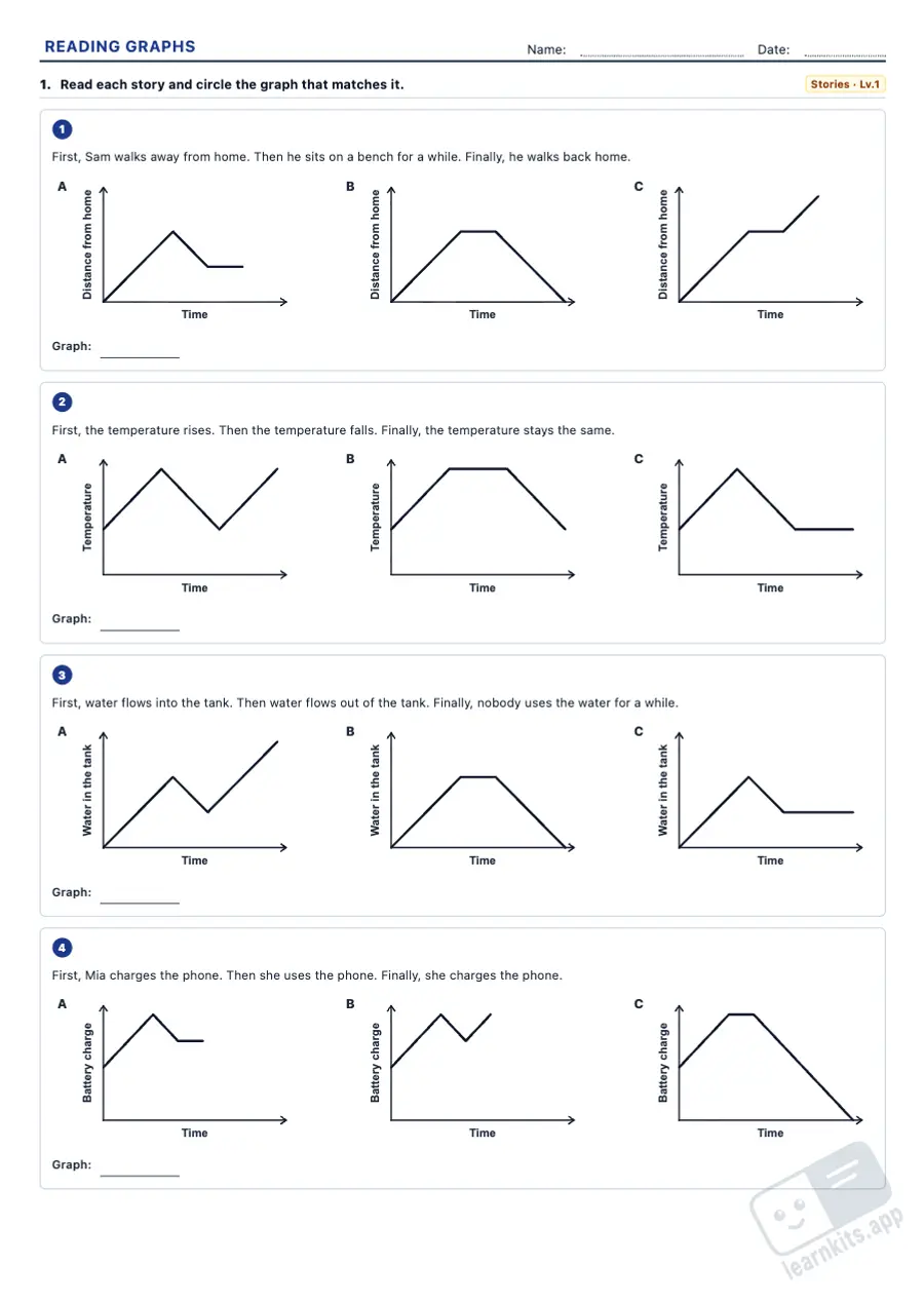 Student worksheet
 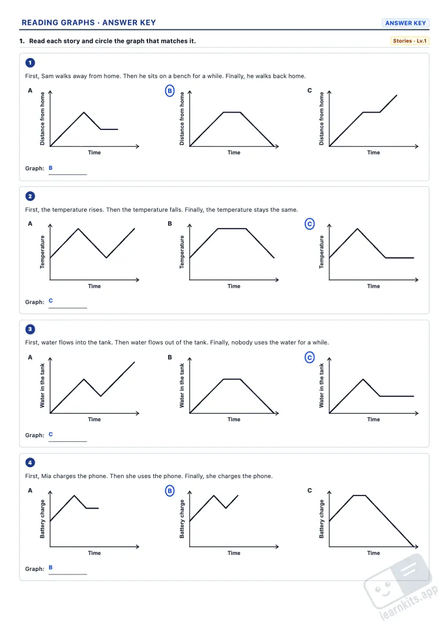 Answer key
 Match a story to its distance-time, temperature-time or battery graph: rises, falls, stops, quickly or slowly.
Read values, when a value is reached, the speed or rate of a stretch and, in secondary, the average rate of change.
Describe whether a series rises, falls or stays the same, where it changes fastest, the percentage change and what happens if it goes on.
Two lines on one graph: when they meet, which grows more and, in Grades 9–10, absolute against relative growth.
Axes that do not start at 0, unequal steps and 3D pie charts: find the trick, work out the real change and argue.
Answers worked out from the values on the graph, with the calculation, and the right graph circled.
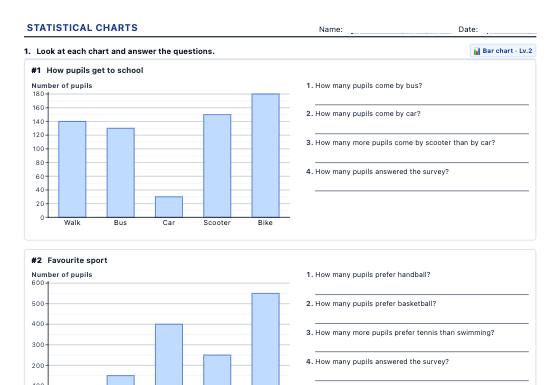
Pictograms, bar charts, line graphs and pie charts to read and to draw, and frequency tables with mode, mean and median, with new data every time and an answer key.
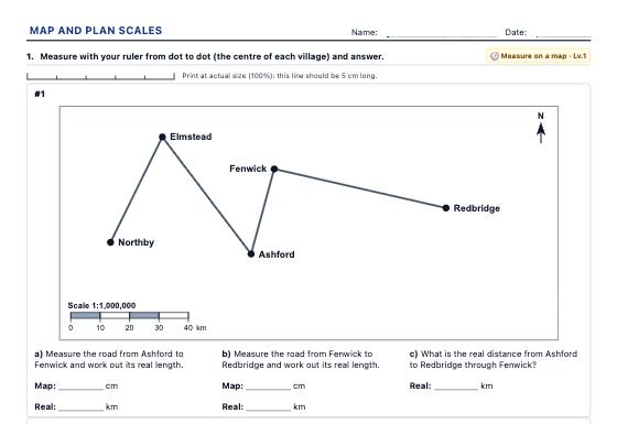
Ratio scale and scale bar worksheets: real and map distances, finding the scale, and village maps and floor plans printed at true size to measure with a ruler.
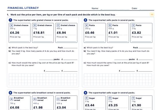
Shelf labels, invoices, receipts, budgets, payslips and bank statements to practise unit price, discounts, VAT, tariffs, simple and compound interest and loans, with a step-by-step answer key.