Real data
Population by sex and 5-year age group for 40 countries on every continent, from the World Bank and the United Nations, with the source on every sheet.
A population pyramid (age-sex pyramid) is a double bar chart of the men and women in each age group. Its shape tells a country’s demographic story: birth rate, mortality, life expectancy and migration. This free generator creates A4 worksheets with real data from 40 countries in four years (1960, 1980, 2000 and 2023) to read, draw, work out indicators and compare pyramids, with a full answer key.
Population by sex and 5-year age group for 40 countries on every continent, from the World Bank and the United Nations, with the source on every sheet.
Questions to read bars, classify the pyramid and explain its shape, from simple to open-ended.
The table and a grid with the axes drawn, in 10-year or 5-year groups. The answer key shows the finished pyramid.
Percentage of young people, adults and older people, dependency ratio, ageing index and sex ratio.
Two countries on the same scale, or one country in 1960 and 2023, to understand the demographic transition.
Every pyramid type is justified with the printed data: base width, widest adult group and percentages.
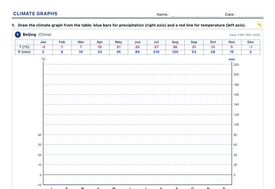
Climate graphs with real weather station data to draw, analyse (temperature range, mean temperature, dry months) and identify the climates of the world and of Spain, with an answer key.
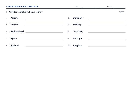
Worksheets to write the capital or the country, match them with arrows and choose the right answer, continent by continent and at three levels, from the best-known countries to every UN member.
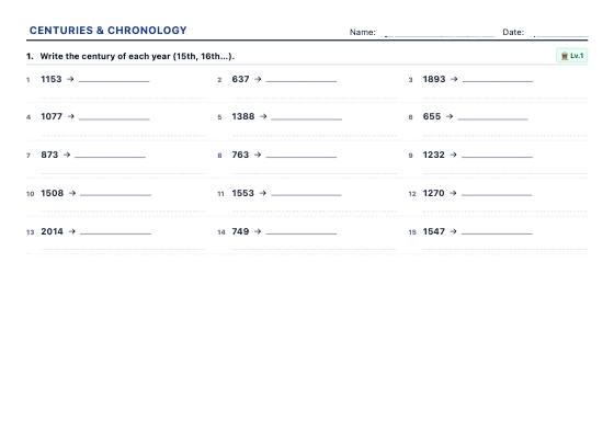
Unlimited exercises to turn years into centuries, place dates BC and AD, work out elapsed years and put events in order, with an answer key.